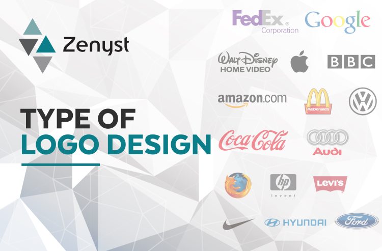
Within the realm of forward-thinking businesses, the logo plays an indispensable role. Not only does it foster brand recognition, but it also becomes a potent differentiator in a crowded marketplace. Yet, like any worthwhile endeavor, a strategic plan is essential.
However, embarking on the logo creation journey requires a crucial starting point: selecting the appropriate logotype. This decision lays the foundation for a logo that encapsulates your brand, attracts your target audience, and sets you apart in a sea of competitors.
This article delves into the realm of logos, exploring their various types, offering popular examples, and providing insightful guidance on identifying the logo style that aligns seamlessly with your business.
1- Abstract Logos

Abstract logos are designs that employ non-literal shapes, colors, and patterns to craft a distinctive and visually captivating brand representation. In contrast to symbol or pictorial mark logos that often depict recognizable objects, abstract logos focus on artistic expression, veering away from direct correlations to a brand’s products or services.
These logo marks hinge on conceptual or artistic elements to convey meaning, stir emotions, or encapsulate a brand’s essence. They leverage geometric shapes, fluid lines, gradients, and abstract compositions to forge visually appealing and unforgettable logos.
The allure of abstract logos lies in their interpretive quality, permitting viewers to shape their interpretations and associations with the design. They can exude creativity, innovation, and uniqueness or evoke specific moods and aesthetics.
Abstract logos span various industries, representing brands aiming to distinguish themselves and project an artistic or conceptual identity. Familiar examples encompass Spotify, Nike, Pepsi, Slack, and Unilever logos.
2-Lettermark Logos
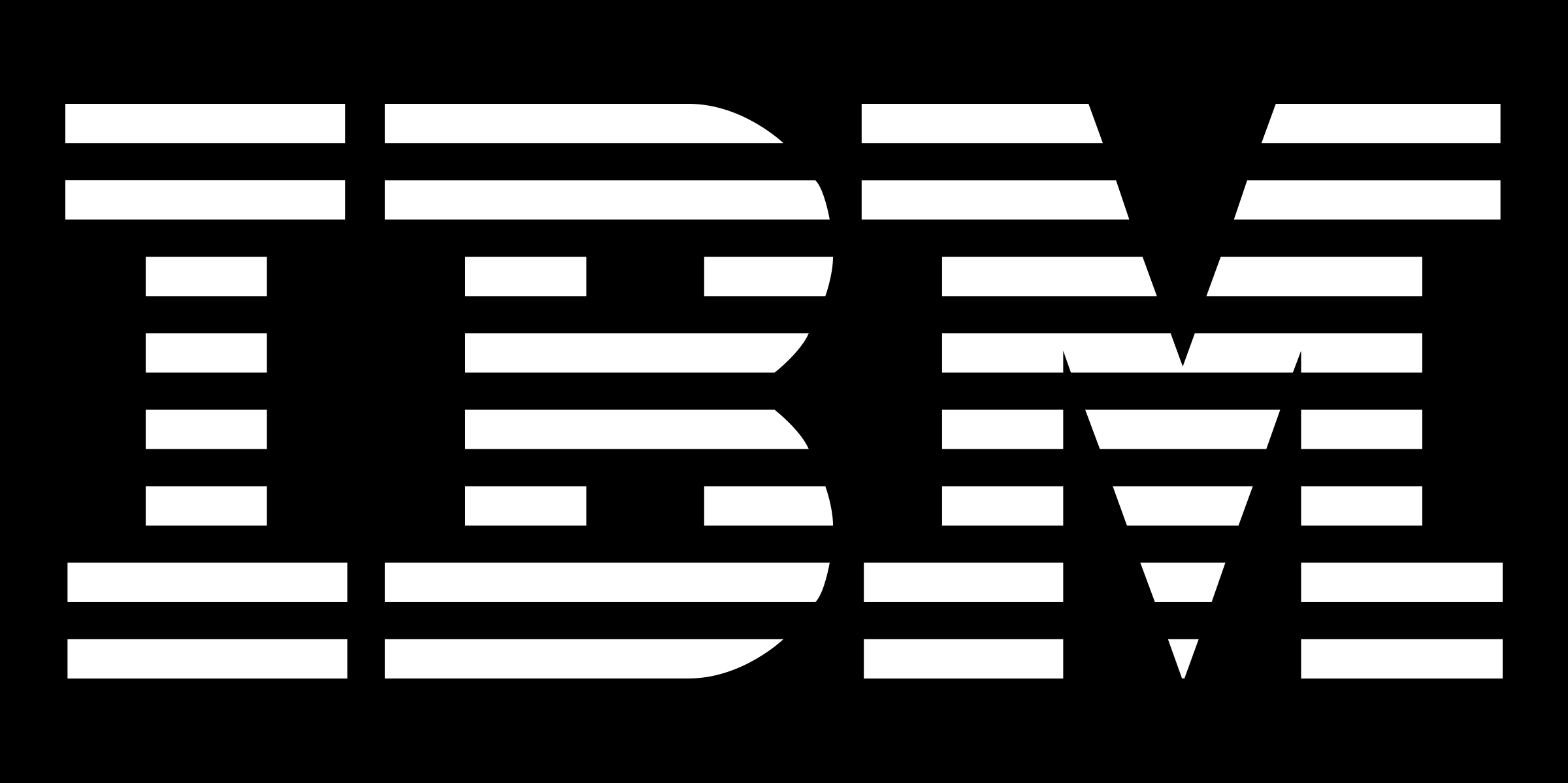
Lettermark logos are a logo design type that employs initials or acronyms to symbolize a brand or company. Rather than spelling out the complete name, the logo crafts a distinctive and compact design by merging or stylizing the letters of the brand’s reputation.
These logos prove incredibly beneficial when a brand name is lengthy or challenging to pronounce. They also shine when the initials or acronyms hold more recognition and memorability than the full name. By concentrating on these, lettermark logos streamline the visual portrayal of the brand while preserving its identity.
Examples of lettermark logos include IBM, HBO, P&G, NASA, JVC, and CNN.
3- Wordmark Logos
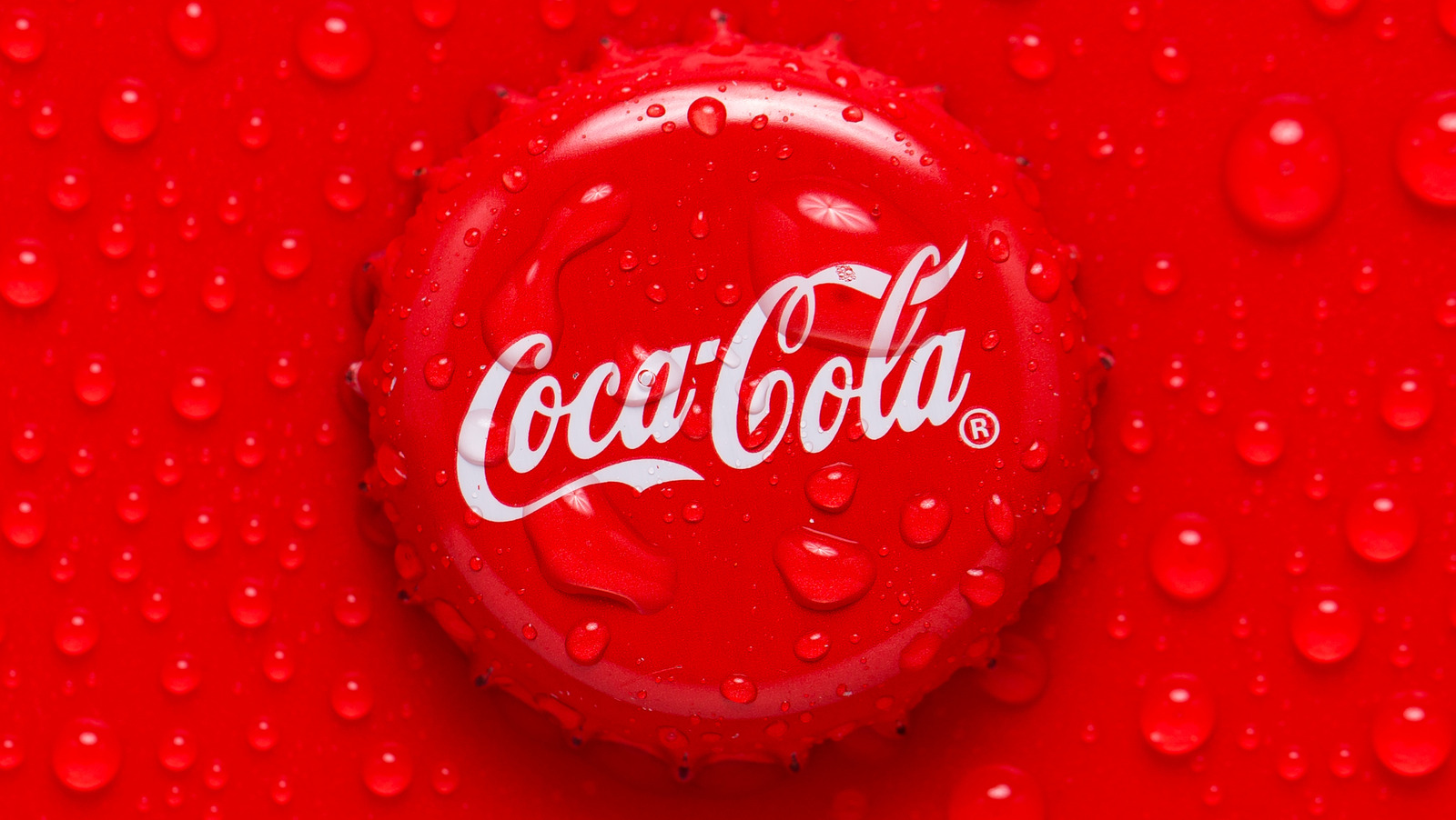
Wordmark logos are all about the art of typography in representing a brand or company name. They wield distinctive, stylized lettering to craft a truly unique visual identity. Devoid of symbols or icons, wordmark logos hinge entirely on how the letters are arranged, styled, and the font selected, all working in harmony to birth a memorable and easily identifiable logo.
In the realm of wordmark logos, the goal is to use typography to convey a brand’s personality, values, and core essence through the visual embodiment of its name. Noteworthy exemplars of wordmark logos include Google, Disney, and Coca-Cola logos.
4- Emblem Logos

Emblem logos are a breed apart in the logo design realm. They ingeniously blend text and imagery into a cohesive, often enclosed shape or emblem. These logos frequently sport intricate and detailed designs, with the brand’s name or initials thoughtfully positioned inside or around the central emblem.
Emblem logos can take on various forms, resembling badges, crests, shield-like shapes, or seals. They exude an aura of tradition, heritage, or authority, often incorporating a rich tapestry of design elements such as icons, typography, illustrations, or intricate patterns. These elements serve as vessels to convey the brand’s identity, values, or industry.
Emblem logos are often linked with organizations, institutions, governmental bodies, and brands aspiring to exude prestige, authenticity, or professionalism. They conjure feelings of tradition, history, or artisanal craftsmanship. Notable examples of emblem logos include Paramount, Burger King, and Warner Bros.
5- Mascot Logos
Mascot logos are a playful and engaging breed of design that places a character or mascot at the heart of the logo. These logos typically showcase an illustrated or stylized character that embodies the brand or company, often possessing distinct personality traits or characteristics.
Mascot logos are cherished for their friendly, approachable, and often whimsical demeanor. These mascots can take various forms, from humans and animals to mythical creatures or anthropomorphic objects. They’re meticulously crafted to resonate with the intended audience, stir emotions, and create a memorable brand identity.
This logo style finds frequent use in sports teams, educational institutions, consumer products, and brands aimed at a younger or more relaxed demographic. A mascot logo excels in forging a personal connection with customers, infusing a sense of delight or nostalgia, and setting a brand apart from its competitors.
Some iconic examples of mascot logos include Pringles, the Michelin Man, Monopoly, Kellogg’s, and Planters.
6- Monogram Logos
Monogram logos are a breed of logo design that artfully merges or stylizes multiple letters, frequently initials, to craft a distinct and memorable emblem representing a brand, company, or individual. These monograms typically amalgamate the initial letters of a company or individual’s name or other noteworthy words.
Simplicity and elegance are hallmarks of monogram logos. They offer a canvas for diverse styles, from intertwined letters and overlapped shapes to bespoke typographic treatments. Consequently, monogram logos are prevalent in personal branding, luxury, fashion, and the professional arena.
Some illustrious monogram logos include Louis Vuitton, LG, Chanel, and HP.
7- Letterform Logos
Letterform logos, also referred to as typographic logos, constitute a unique category of logo design. They center on the imaginative manipulation and transformation of letters or typography to create a distinctive and visually captivating emblem that embodies a brand or business. In these logos, letters take center stage.
Unlike logos that rely on symbols, icons, or illustrations, letterform logos place a strong emphasis on the artistic manipulation of letter shapes. This manipulation can involve custom typography, the interplay between letters, or imaginative arrangements, resulting in an unmistakable and memorable visual identity.
Letterform logos can embrace a wide range of typographic styles, including serif, sans-serif, script, or customized lettering. They often strike a balance between readability and artistic flair, infusing unique elements to set them apart. Notable examples of successful letterform logos include Netflix, YouTube, Sony, Volkswagen, and Amazon, among others.
Conclusion

Choosing the correct type of logo is a critical step in building a robust brand identity. Whether it’s an abstract logo, lettermark, wordmark, emblem, mascot, monogram, or letterform logo, each style offers unique advantages and communicates different aspects of your brand’s personality and values. Understanding these logo types and their characteristics can assist you in making an informed decision when crafting a logo for your business or personal brand. Remember, a well-designed logo not only enhances brand recognition but also sets you apart in a competitive market.
